JAMES VINCENT WROTE IN the LRB about the meaning shifts behind the cardinal points.
Brotton ends his survey by noting the year the reign of the compass finally expired: 2008, which saw the launch of the iPhone and the creation of the blue dot, the constant marker in map apps by which we now orient ourselves. ‘In this our digitised century,’ Brotton writes, ‘there are now five directions – north, south, east, west, and the online blue dot: “You”.’ Paper maps have given way to the dot, which is now ‘pre-eminent, superseding compass directions which, for many, become irrelevant. Eyes glued to that jerky little blue ball, we spend less and less travel time observing the physical terrain through which we move.’
This is partly true: with the decline of paper maps we've also experienced a centralisation of mapping, with maps from a number of centralised services taking the place of very diverse variations on specialised maps and spatial diagrams. Google Maps, Apple Maps, Open Street Maps (which, with wikipedia, has unexpectedly become one of the genuine wonders of the modern world), and a few others relevant to despotisms, like Yandex. If you or I use a map it will likely be one of these, and it will present the world according to its own ideological contours. Roads navigable by cars are totally predominant, especially on Google Maps where the street view survey is integrated. Advertising is key, which is a thing common to the history of modern mapping, but which takes new forms.
Some specific services should take credit for customising, via third party data-presenting tools like mapbox. NSW Transport Info is one of these, a really well-done web service that presents OSM data in a way that centres public transport---but it's still OSM under the bonnet.
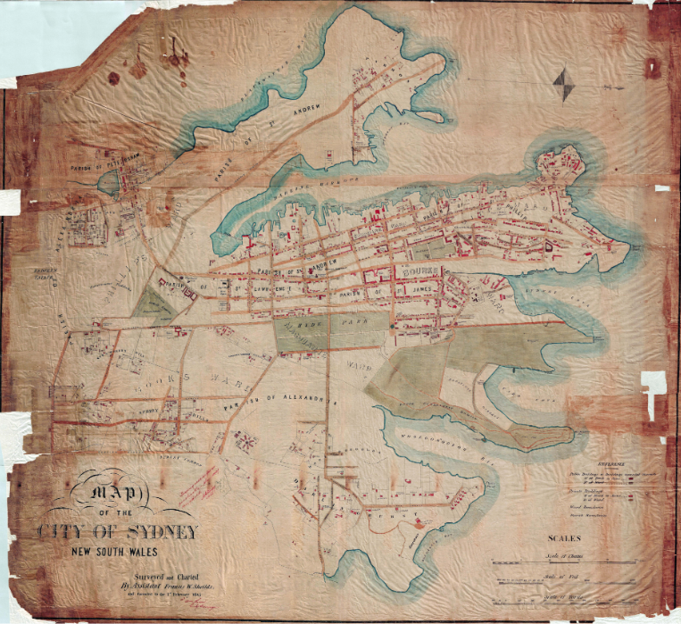
Compare it to Sheilds 1845 map of Sydney, one of my favourites, which is rotated ninety degrees from where you or I would expect Port Jackson to be drawn. But it makes sense for the reader: here is Sydney laid out in a nineteenth century hierarchy, legible like English, left-to-right, from Chippendale and Redfern, then an area of brickpits and slums, through to the commercial wharves, to the barracks and drill square, the public buildings of the centre of town, and last at the far edge, for the colonial English-minded mentality of the time, to Sydney Cove, to the harbour, to the sea, and to home.