BUILDING DESIGN SHARES A lot of similarity to the spread of memes on the internet. A successful configuration that resonates with people’s experience of the world, or to the experiences of some group of them, will reproduce itself in self-similar ways. Designs that become popular are that way because they respond to specific needs and desires, and carry symbolic meaning, not because they are intrinsically good. Surviving designs, like memes, don’t last because people like them, they survive because they’ve outlasted other worse ones.
In Australian inner cities there is a specific memetic house design that became popular in the 19th century and has stayed that way: terrace blocks of houses, each one with a short verandah, a front door to a side corridor, a front window to a room, with a flight of something less than a dozen stairs up to the entrance, and the kitchen set at the very back. They’re of one, two, and more rarely three storeys. Depending on topography and budget, style and taste and age, that’s a design meme that’s stamped out suburb across suburb, in variations so small, when you get to them, they just don’t matter.
That short flight of stairs does a few things really well. First of all, it keeps water from coming in when it rains, and blown debris from piling up around the door when it’s windy. Second, that height is an allowance for space underneath the house, to insulate: if you’ve ever lived in a house where the floor joists lie straight on the dirt, you know how cold and mouldy it is. Lastly, and most importantly, it’s height that gives privacy and light, so that someone in the front room can see easily onto the street, but someone on the street can’t easily see someone in bed in the front room, and that front gets more sunlight than the street does. It’s a very old, traditional form that has been desirable and meaningful for a long time; and the principle of raising a living-area floor to a higher level is ancient. They work.

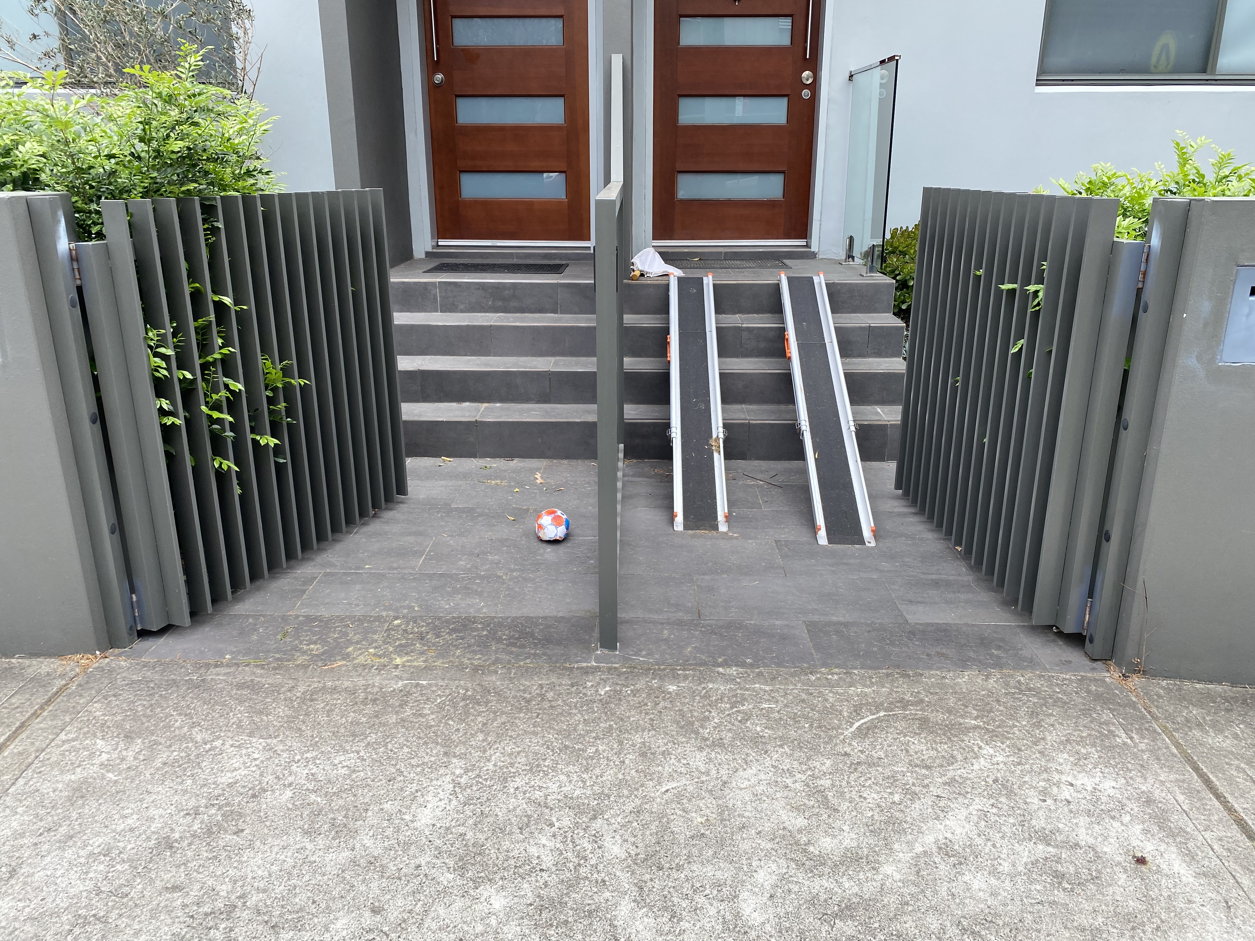
Here’s the problem though: the terrace design-meme, while very humane and recognisable, is horribly inaccessible. In the picture above, the residents have added their own ramps for what’s most likely access for a stroller or pram, another memetic design solution you see people add everywhere, in every variation of designed ramps, planks, boards, every kind of improvised solution.
It’s extraordinarily hard to reconcile the design requirements to be private, to be dense, and to allow street-grade access, without changing some fundamental things about what makes the terrace design terrace-y. You could add a much larger front garden, or add a wall at the front. You could reconfigure the house simply not to have a front window, or have a front door extremely set back to a side, or front the street with a roller door garage. You could design the main access from a rear lane. All these things in fact have been done and are done, against huge resistance from neighbours and Council, since all of them alter the terrace form from what it is to something else. Eventually, in fact, what you do is invent the car-centric suburbs, and lose, in gaining functional accessibility, the communal benefits of terraces.
No wonder people just shove ramps in.